This is the first issue in the WVLS Digital Lites blog series called “Boost: Tips and Resources to Enhance Service at Your Library.” The purpose of Boost! is to encourage reflective librarianship, to help libraries reflect on what they do, and how they can improve serving their community. You will find these messages in your email and as a Digital Lite on the WVLS website. You can find this issue and all forthcoming issues of Boost! on the Digital Lites page by selecting “Boost” in the “Categories” control on the right side.
Library users are bombarded by signs when they enter the library. First impressions are important and negative signage can start a library user’s visit on a wrong note. “No this,” “remember that,” “sign up here,” “photo copier over there,” and the signs go on and on. Following are suggestions to make your library’s signage more welcoming and effective.
Take a Tour of Your Signage
Walk through your library and observe signage. Use this checklist to refresh and revitalize your signs.
- Do signs feature the library logo or name?
- Do signs feature a consistent font set?
- Do signs feature a consistent color palette or design?
- Do signs use language consistent with library policy?
- Do signs use positive language? See description of positive signage below and watch the Practical Graphic Design for Libraries webinar from Aaron Schmidt.
- Do signs avoid using library jargon? (patron, periodical, circulation…)
- Do signs use images that reflect the diversity of the community?
- Do signs use all languages spoken in the community?
- Are font sizes readable from a distance?
- Are signs yellowing or in poor condition?
- Are signs created with the same materials? (laminated, framed? On card stock, etc.)
- Are signs hung similarly?
- Are signs hung at an appropriate height? Appropriate location?
- What areas could benefit from signage? What areas do not need signage?
Positive Signage
Aaron Schmidt, a user experience design leader at Influx and a 2005 Library Journal Mover and Shaker, explains positive signage. In his article “Positive Signs: The User Experience,” Schmidt says signage should not “be negative, mean, accusatory, or defeatist. Criticism can and should be done positively and with good intention. After all, more flies get caught with honey, right?”
Schmidt emphasizes the importance of starting with good design. All signage from an organization should use legible and appropriately sized fonts paired with a logo and consistent positive design. Signs should emphasize what can be done instead of what can’t be done.
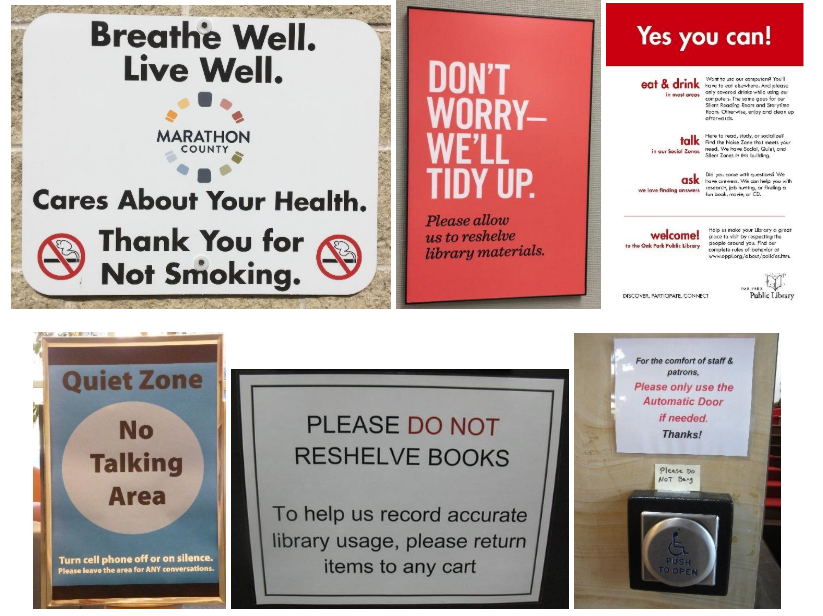
Marathon County Public Library provides a great example of this. Instead of “No Smoking!” in harsh block letters, a sign on the Marathon County Public Library Wausau building reads: “Breathe Well. Live Well. Marathon County Cares About Your Health. Thank You for Not Smoking.” When signage is positive, mirroring the friendly service team members provide in-person, library users notice. See the gallery below comparing positive and negative signage below the article.
 Take a step further and ask library visitors what they see. What do they like? What do they not like? Library users may have a different perspective compared to staff who see signage every day.
Remember, signage can be fun and used in creative spaces: on pillars, shelf-talkers, chalk boards, end-caps, hung from the ceiling or banisters, free standing placards, window clings, window drawings.
Creating Signage
You do not need expensive software to create good design. You can use Microsoft Publisher to create your designs, but I suggest you create a free account with Canva.com. Canva.com uses a drag and drop building method rather than requiring the user to have or learn Microsoft Publisher controls. Canva.com is a website that allows you to create designs in any size and provides free downloads of your files in multiple file types for print or internet use. Canva.com provides free and for-cost templates to get you started for both print and web-based designs: flyers, social media posts, postcards, email headers, you name it. Upload your logo and start playing with this drag and drop tool. Additionally, you can apply for Canva for Non-profits account as a library by filling out the brief application form and including a note in the comment section that you work for a public library. Canva for Non-profits accounts include more free features and controls that make a big difference in creating your designs.
Still unsure of your capabilities? Browse design tutorials, then find examples of good design (or signage) and recreate it in Canva. One way to learn how to create good design is to copy good design. Adjust the design for your content and logo and keep practicing. Your instincts and signage will improve as you practice.
Further Reading, Watching, Browsing
- Hamland, Anne. Signage. Pinterest Board.
- Schmidt, Aaron. Practical Graphic Design for Libraries. November 15, 2017. Nicolet Federated Library System and Wisconsin Valley Library Service. Webinar.
- Schmidt, Aaron. Positive Signs: The User Experience. Library Journal, September 3, 2015.
Signage Credit
- Arch, Jenny. “For the comfort of staff & patrons.” September, 19, 2015.
- Casvelyn. “Please do not reshelve books.” 2015.
- Marathon County. “Breathe Well. Live Well.”
- Oak Park Public Library. “Yes you can!” 2011.
- Saunders, Michael. “Quiet zone: no talking area.” Topeka Shawnee County Library. 2010
- Suzy the Elf Shelf. “Don’t Worry-We’ll Tidy Up.” Chandler, AZ.
You can find this edition of Boost! on the Digital Lites page by selecting “Boost” in the “Categories” control on the right side.
Submitted by Anne Hamland

